Current SYMBOLS LIST.
Overlay Expansion Proposal.
APRS SYMBOL ATTRIBUTES: One of the most important aspects of APRS is the display of tactical information on maps using symbols for each station. Each such SYMBOL has several ATTRIBUTES that convey additional meanings. In the original APRS, these additional attributes were displayed with COLORS and circles. Some new software has taken a more simplistic approach and simply usees fixed color ICONS but without any displayed attributes. Thus, the users of these systems are blind to attribute information on their maps without having to click on each one... This operator intensive masking of important information does not do justice in some cases to the original intent of APRS information display to the end users.
The image below is a screen capture of the APRSdos F1-HELP-SYMBOLS screen showing the user all of the different symbols available. All of those shown in White can display most of the additional symbol attributes by their color.

This next image is an extracted subset showing those symbols that can be overlayed with 0-9, A-Z. In this example, they all have the overlay caharacter "3".
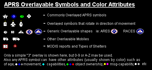
ATTRIBUTE TYPES: All of the symbols shown above are in WHITE which is the representation of the symbol when it is transmitted by a fully capable APRS platform, usually meaning it can send and receive messages. For example, if the station is a dumb-tracker with no message capability then it is displayed in GRAY. The following table describes all of the SYMBOL ATTRIBUTES in APRS and the color used in most cases to convey them on the map:
NOTE: Nothing requires authors to have multi-color symbols to convey these additional attributes, but no matter how it is presented, these Symbol ATTRIBUTES are important information about a SYMBOL on an APRS map that should be conveyed somehow graphically to the user..
ACTIVITY BIT: . This bit is was proposed in the year 2000 time frame to make it easy to quickly select a map showing only stations that have an operator present. Since no consensus was found, this feature was moved to the APRS1.2 addendum. . The key features of this activity bit are:
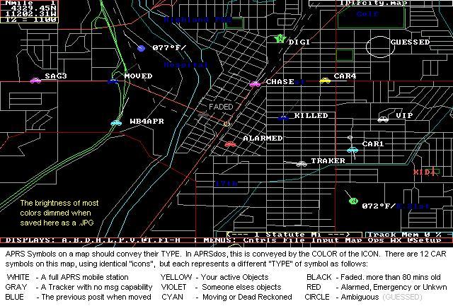
EXAMPLES: The below APRSdos screen capture displays a number of these features using 12 identical stations or objects all using the CAR symbol. Note how valuable these attributes are to conveying quick meaning to the participants in an event. It conveys at a glance, who is moving, who is old, who is an object, what you are responsible for, and many other important variables associated with the real-time tactical display.

Notice how CAR1 and WB4APR have been deadreckoned since more than a minute has passed since their last positions came in. Therefore their last known position is marked with what I call their "anchor circle" and then the Symbol has been moved to where they could be now based on their last known course and speed.
IGate Identification: Since Igates occasionally use a symbol other than the GATE with an Overlay "I", they can also be distinguished by their periodic IGATE Status packet. APRSdos, UIview and WinAPRS use this to draw a circle or other distinguishing attribute so that these stations can be clearly identified.
Ambiguity Plots: . Since not all positions in APRS are known to the same precision, a significant attribute of all APRS symbols is the provision to show the four ranges of ambiguity of 0.1, 1, 10 and 60 nautical miles. . Notice how the object named GUESSED above is not shown with a symbol, but with a circle. This is because this station is transmitting or entered with a 1/10th mile ambiguity with his position. The station's symbol does show up at large area scales, but once you zoom the map below the scale at which the size of the ambiguity is larger than the "size" of the symbol, then the symbol disappears so that there can be no missinterpretation by the person viewing that there is precision where there is not. These ranges of ambiguity are conveyed just like a written position is conveyed. If a position is only known to the nearest degree (60 nm), then only the degrees are sent. . If the position is only known to the nearest minute, then only the degrees and integer minutes are transmitted. . and So on down to Tenths of a minute. If all digits are known, then the position conveys the full precision inherent in APRS which is to the nearest 100th of a nautical mile or about 60 feet.
Ambiguity in the Spec: . There has been lots of confusion over Position Ambiguity caused by the poor wording in the spec that can be incorrectly interpreted as implying a truncation of digits and a lat/long box of ambiguity. . It is not a truncation and it is not a box. . The position field in APRS is a string field, not a numeric field. . One should place in that field by inclusion only the digits the sender wants the receiver to use. . Further the spec implies that this results in a box of ambiguity. . This is wrong. because it would imply vastly different sizes of inprecision at the equator and at the poles. . It is clear that the intent of position ambiguity was a range in nautical miles, since Ambiguity was defined in the LATITUDE field only, where the digits do correspond to Nautical Miles. . And they do give the same circular area everywhere on earth.
Plotting Position Ambiguity: . The recommended plot of position ambiguity is shown above for GUESSED. . That is, a circle with a radius of the ambiguity centered on the given position. (Not centered in a box of LAT/LONG) . Further, the symbol may be displayed as long as the size of the symbol is larger than the circle of ambiguity. But on higher resolution zooms, when the size of the circle becomes larger than the size of the symbol, then the symbol should NOT be displayed because it implies a location at the center which is incorrect. Only the circle should be displayed at these zooms. . Further, the "center" location of this circle should be slightly randomized (say within half the range of ambiguity) so that if there are many stations reporiting the same location and ambiguity, that all of their circles will show. . These circles are not intended to be precise sizes or edges of ambiguity, but simply a graphical representation to the viewer that these positions are not well known.
Vicinity Plots: Vicinity plots are special cases of the ambiguity plots where the receiving software has received a packet from a new station for which it has no position information. In order to add this station to the APRS system, the software creates a temporary position called a "Vicinity" plot. This position is assigned a random position within 1 mile of the first digipeater in his path. The randomness is so that multiple such Vicinity Plots can be shown. The position actually is given a 10 mile ambiguity so there is no confusion by casual observers. Also, the Vicinity plot symbol is a big question mark and the callsign is NOT shown on the map unless "clicked-on". . When a valid position is eventually received, then the vicinity plot is replaced with the new position. . See an example plot.
Parsing Symbol Attributes: Determining the "attribute" of a given symbol to display is the result of some simple parsing of the various APRS position fields as shown below:

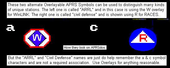
Some have said that it is impossible in Windows to display these attributes using ICONS, but I would think it would be easy to paint a background circle with the color and then place the ICON on it as shown below:

SYMBOLS versus ICONS: APRS symbols were not intended to be fixed-sized/color "icons" but were intended to be whatever it took to best represent the "thing" being represented. The Hurricane symbol is an example as shown below. It is very large and covers a very large area.

The Hurricane symbol covers hundreds of square miles and it expands or contracts at all range-scales (zooms). The twister symbol is shown at the lat/long of the reproted hurricane, but then a red circle is shown at a radius of the reported Hurricane force winds and a yellow circle shows the area covered by tropical storm winds. Further, these circles are offset by the vector sum of the wind speeds and the speed of movement of the storm so that the danger quadrant is bigger than the leward quadrant. As you can see, no one can miss the presence of the Hurricane, nor the area impacted by its winds. Several other symbols in APRSdos vary with map range scale so that the area covered is constant, such as Grid Squares, DX spots, and maybe others. I wish I had had coding room so that Thuderstorms and most other weather objects did the same...
AREA OBJECTS: . Another class of large symbols in APRS are the AREA Objects. These are Boxes, Circles, or triangles that can be drawn on the map from any scale from about 500 feet across to 800 miles across. THey can be any of the 16 primary colors and they can be just outlines of filled. THough caution should be used with the FILLED objects, because they can mask all map features underneath them. Here is an XASTIR plot of some examples:
 Click for full size.
Its curious why the filled circle is a true circle, yet the "staging3"
non-filled yellow circle is painted as an oval.
The latest current SYMBOLS LIST is maintained up-to-date by the APRS working Group.
Just as a frame of reference, it is also interesting to look at the frequency of usage of the more popular symbols put together by James Jefferson. See ( Icon usage data).
Back To the APRS 1.1 Spec Errata Page |
You are visitor number:
Since 24 Sept 2001. (averages about 38,000 a year sinec April 98)..
The Naval Academy is a registered user of APRS and WinAPRS. The purpose of this web page is to show several applications currently in use at this site and should not be considered as an advertisement or an endorsement of any commercial product. WA8LMF Mirror of WB4APR Website - 21 July 2008